Medcazt
App designMedcazt
App designMedcazt
Medcazt is a corporate internal podcast app for the pharmaceutical company Astra Zeneca. The medical team and diagnosis team have access to the most up-to-date news, opinion and research. Medcazt is a tailormade app that brings the later science to them within different categories and to listen on or offline.
I designed the visual design of Medcazt from scratch firstly for iOS, and then we developed the product for Android and also on tablets format.
Info
Sketch
Zeplin
Illustrator
iOS app

Branding
Visual design
To the Astra Zeneca branding guideline’s primary colours, orange and purple I added new colours to create a digital-friendly colour palette and have a large choice of colours to differentiate the podcasts categories. Then, from their iconography and science imagery, I created a library of components and a set of icons that cover all the functionality of the app.
Below: Icons created from the AZ logo shapes to cover all the functionality of the app.
Home screen
Choose your category
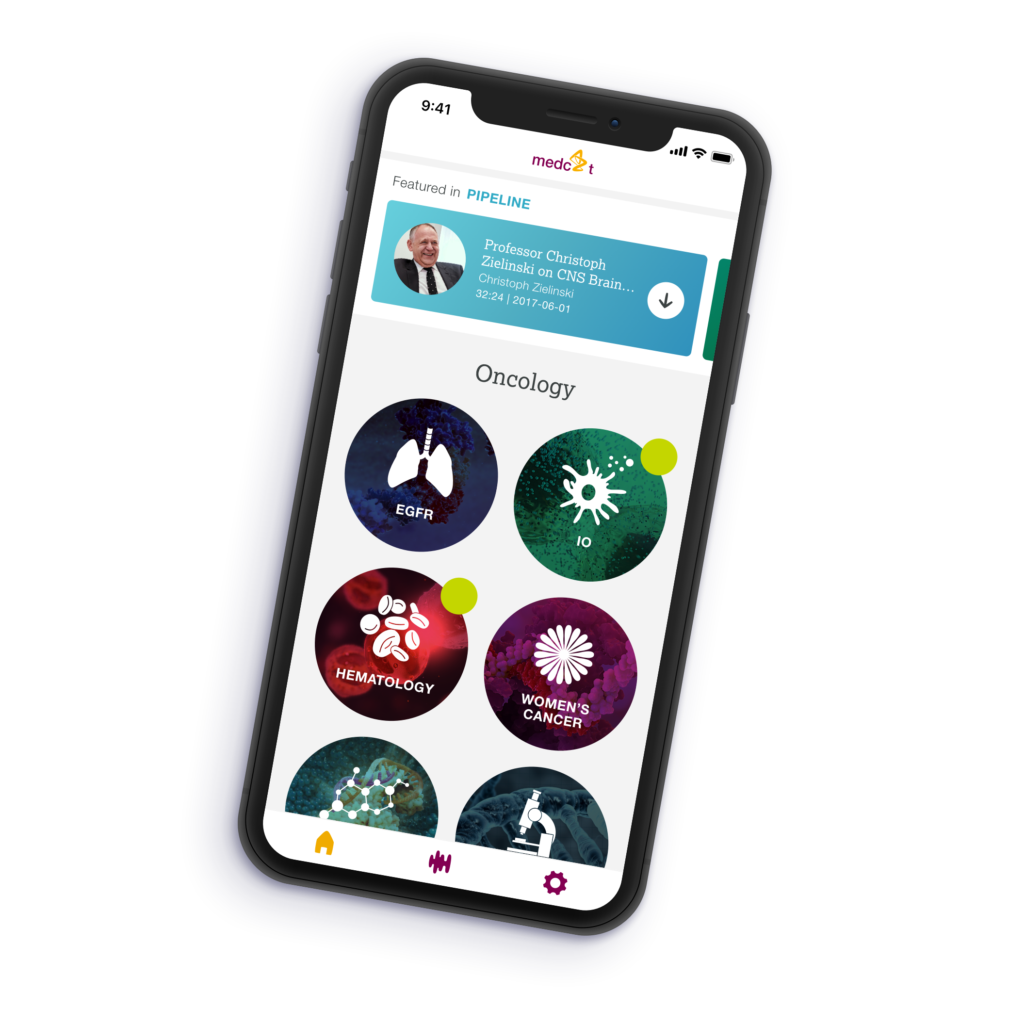
The home screen highlights the featured podcast and shows all the categories.
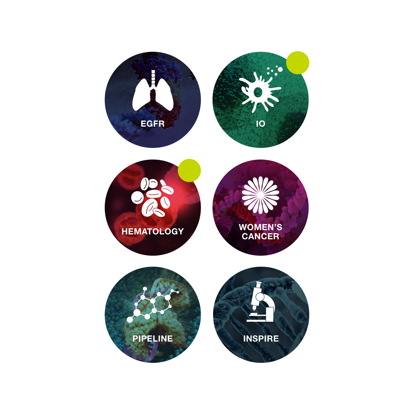
I reused Astra Zeneca medical icons on a modern gradient background associated with their science imagery created for each category.
Tab nav
Easy navigation
From the tab nav always displayed at the bottom of the screen, the user can always easily navigate between the three main sections of the app: Homescreen – My library – Settings.
Categories
Colour code
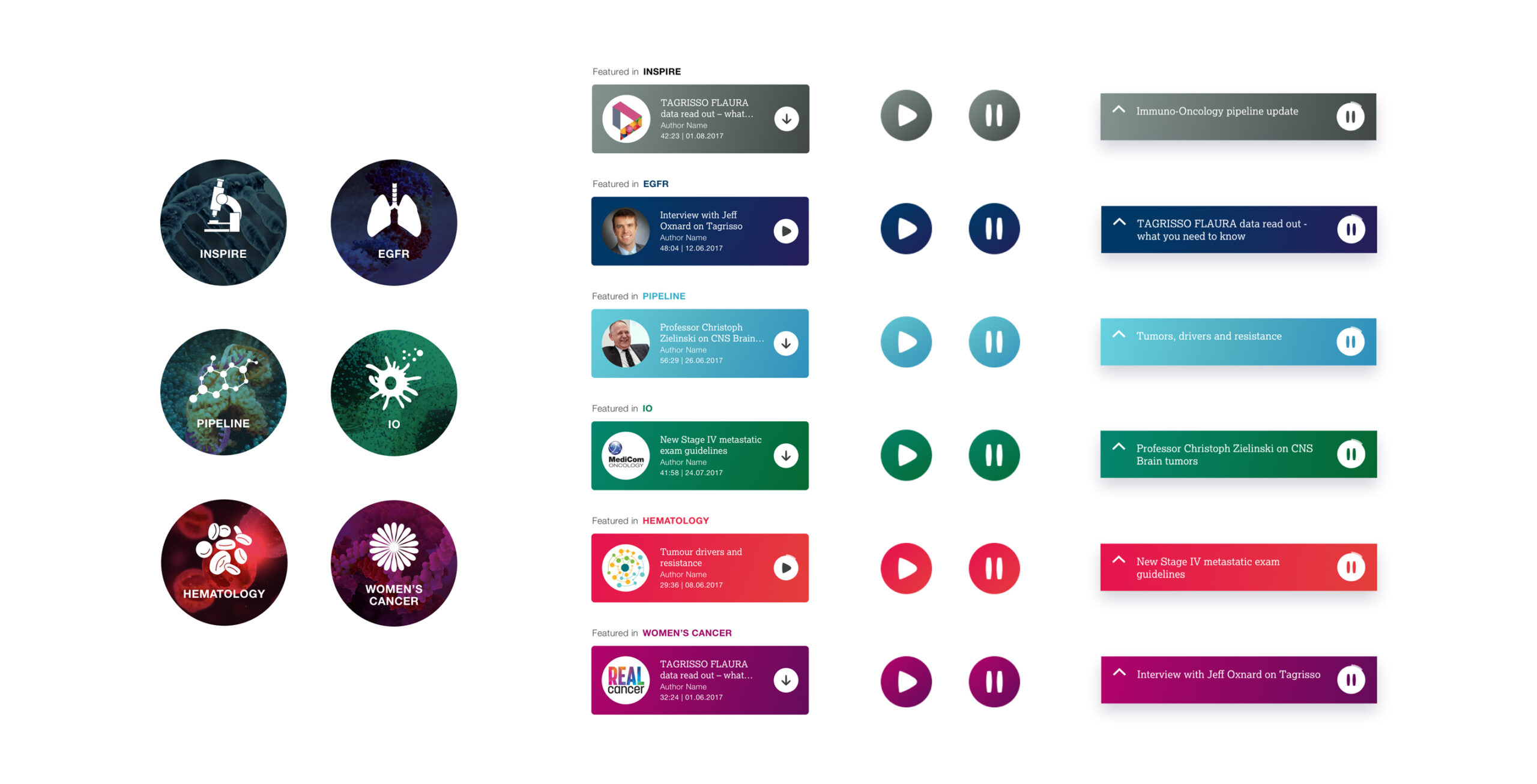
Each category has its own colour, which we can find in the title, icons and players. Each colour has its corresponding gradient and accessible colour for the text.
Library
Always available
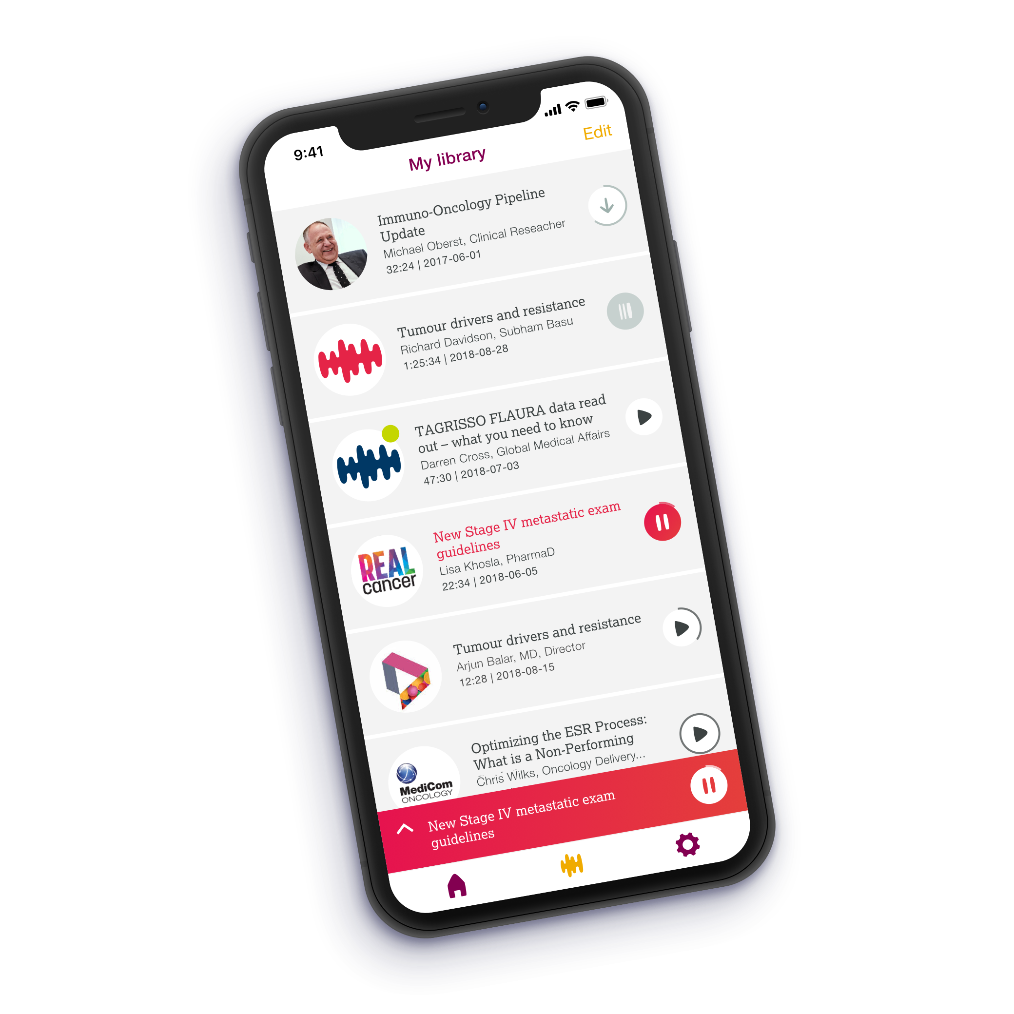
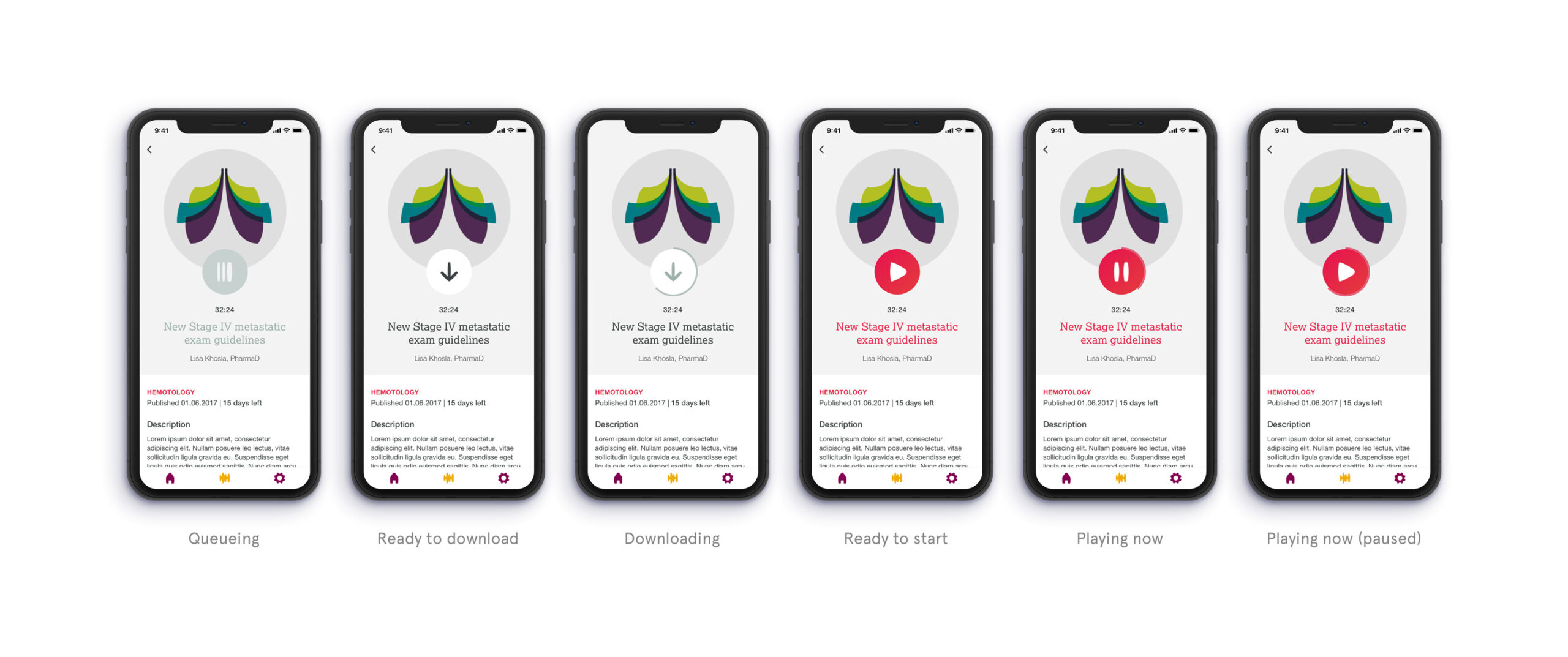
The medical team member can create their own library by saving and downloading the podcast they are interested. They can listen to it wherever they are, whenever they have time by the offline option.
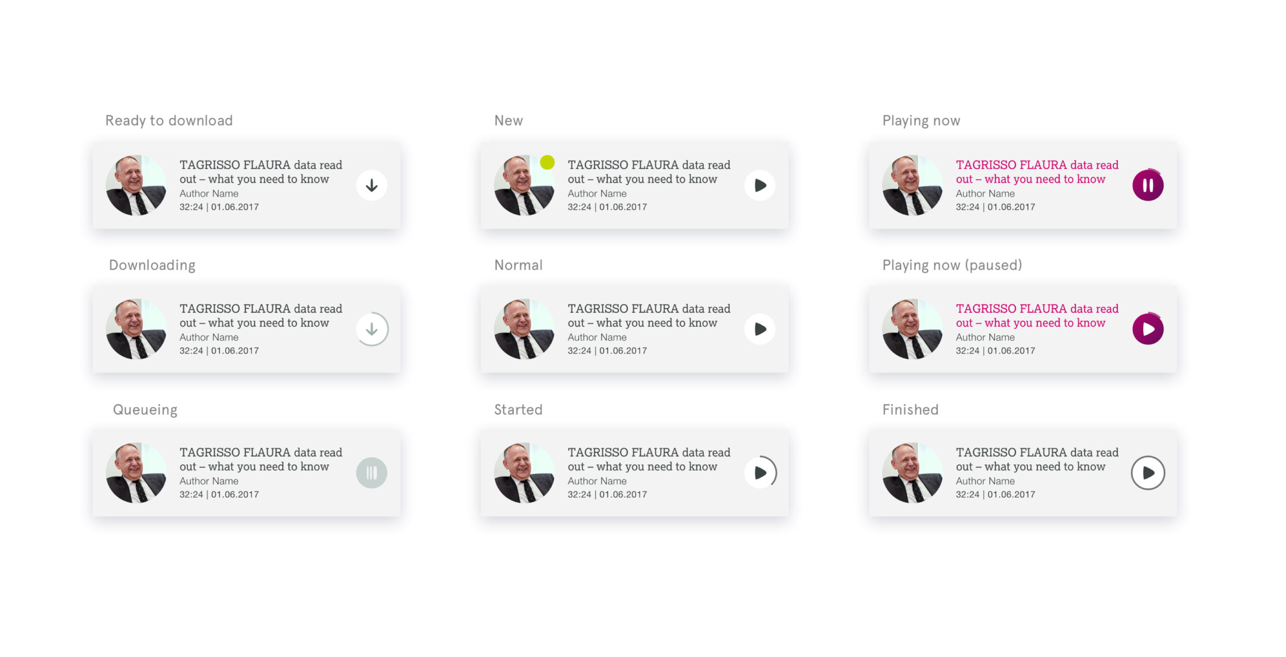
Below: the different states of the podcast in the library.
Podcast
Podcast description
The podcast description gives you instantly its category by the colour used but also the time it will be still available, important added information and any updates about it to always know the latest information about the subject.
Player
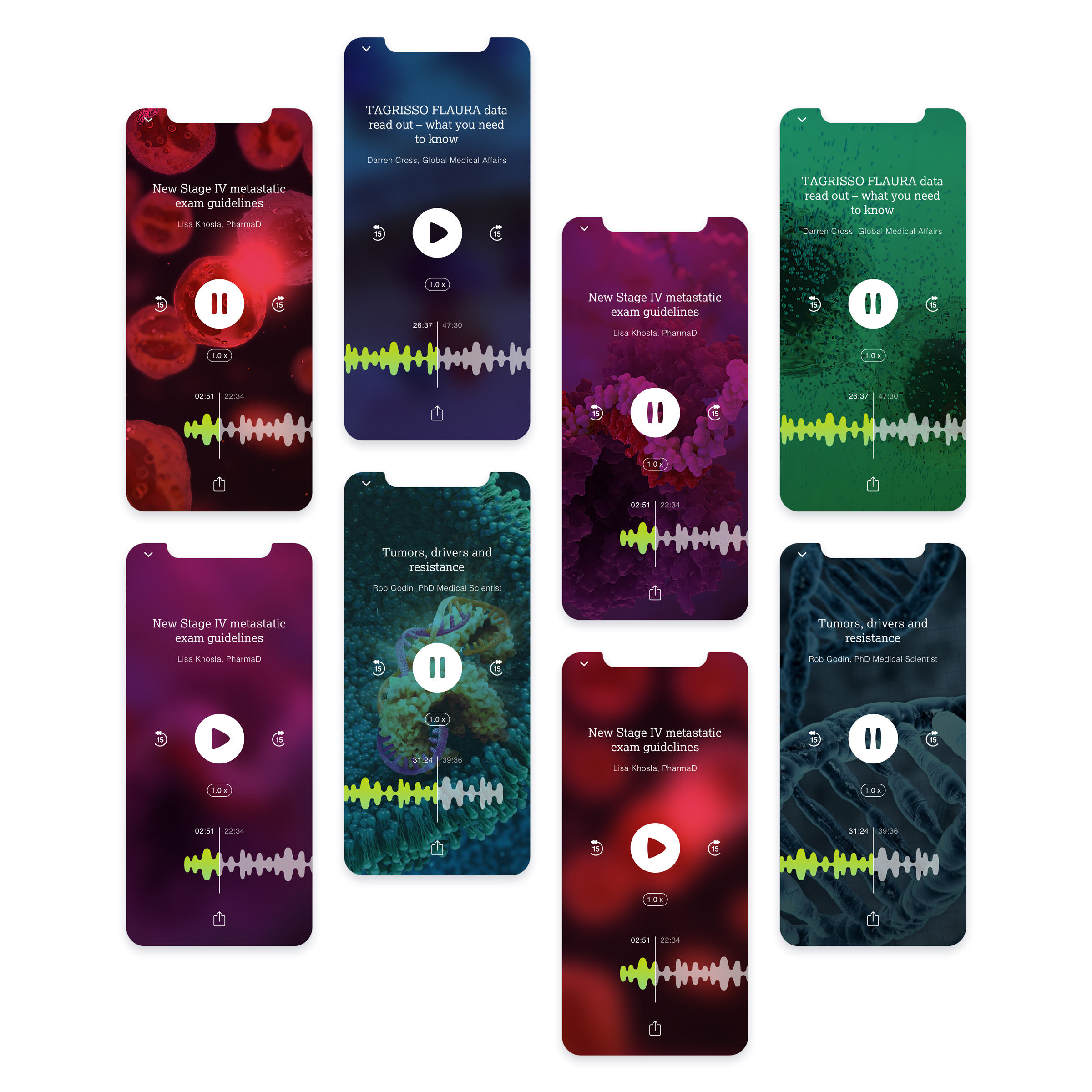
Scientific podcast player
The player uses scientific imagery related to the podcast category and its colour code. It has all the main functions of a podcast player, plays and pauses the podcast, shows the time remaining, rewards or forwards 15 seconds. The user can also touch the Astra Zeneca branded soundwave to navigate through the podcast.
Collapsed player
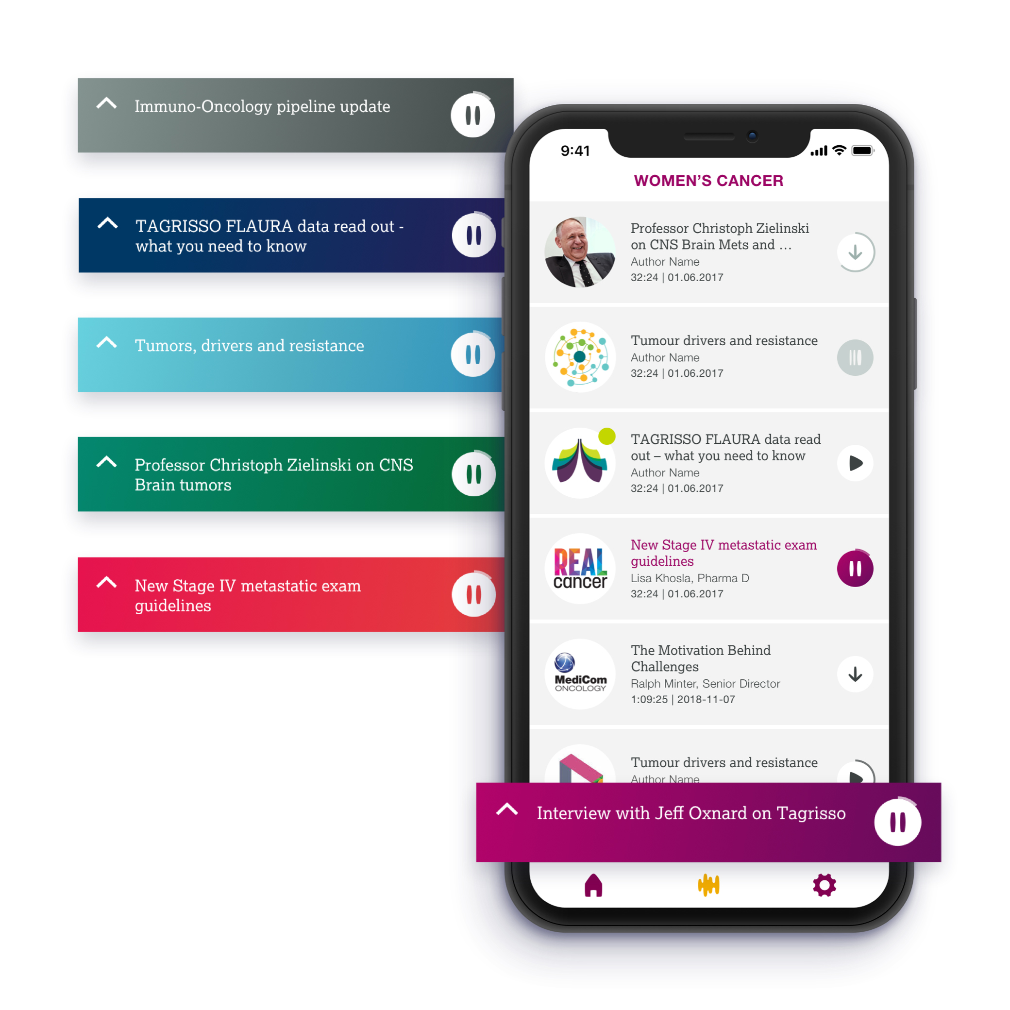
Navigate while listening
You can keep navigating through the app to choose and download your next podcast while playing the podcast. The player will collapse and get stuck on top of the navbar, click back on it and a nice animation will reopen the main player.
UI Components
Design Library
Each component will be repeated in the different categories colours. The podcasts have different states and categories, for this, I created a design library covering all the different states we need and is easy to use on the sketch file.
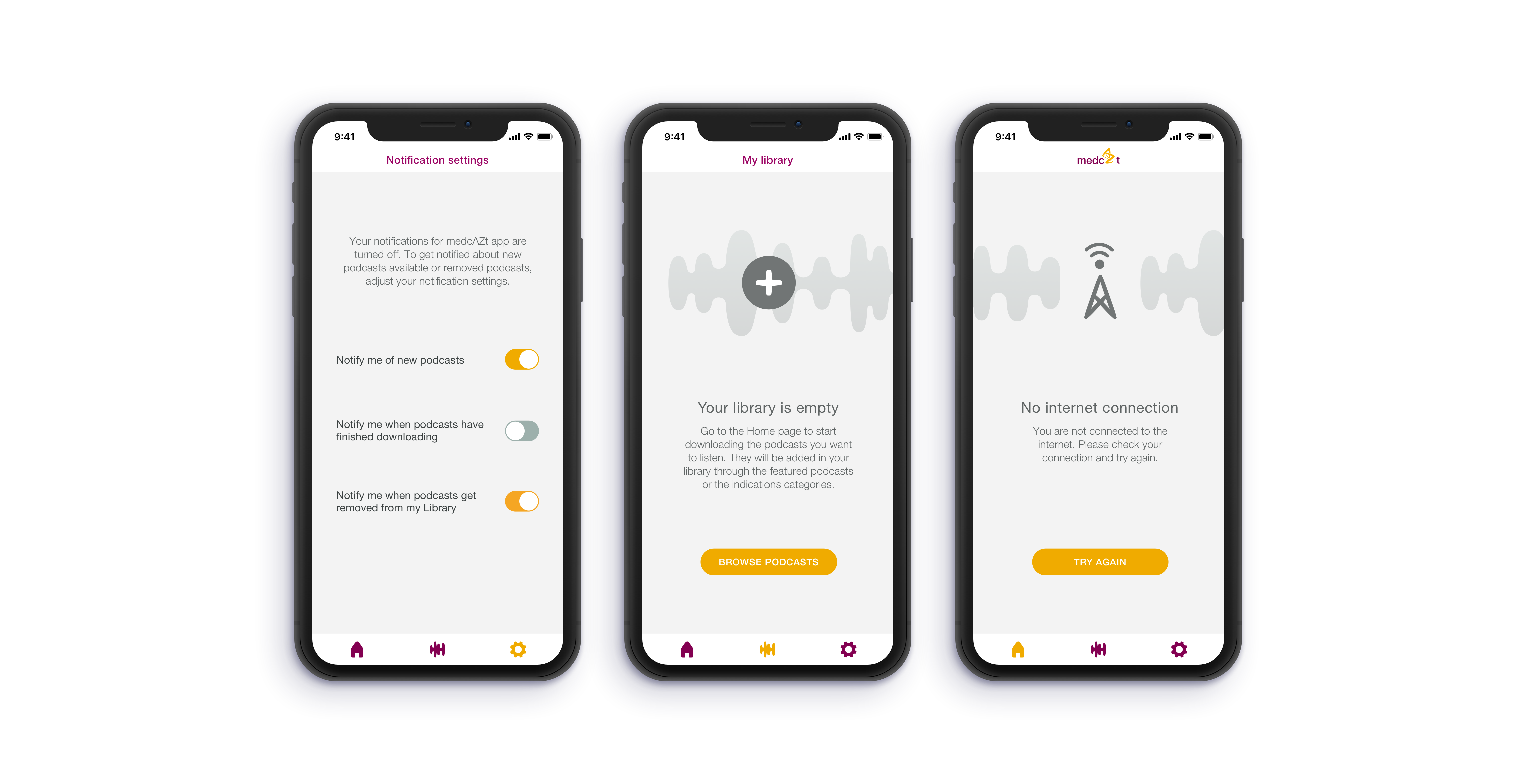
Maintenance & settings
Customised design
The customised Astra Zeneca is used on all the designs. I reused the icon’s style and the sound wave shape to create some illustrations.
Back to home
