How do I recycle?
App design, UXHow do I recycle?
The app to know everything about recycling.
I have been always concerned about how to use less packaging, recycle them better, and how make people aware of it so I created this project around recycling for my personal presentation at the end of the General Assembly London UX course that I took from March to June 2021.
As a Visual Designer I worked for many years in close collaboration with UX designers and designing experiences, I decided to follow an intense short course to perfect my knowledge and refresh the UX methods.
Info
Figma
Illustrator
Context
Most of people are now conscious about recycling. The cities they live in provide them with good recycling services.
But in 2018 in the UK, only 45% of the waste was going to recycling* and the main reason is that people are not sure if some items are recyclable, especially with plastics.**
*Gov UK – Department for Environment, Food & Rural affairs
**Statista 2021
Discover
The problem
How might we quickly provide people the right information about recycling a product so they recycle better?
Discover
Learn how people recycle at home.
Understand what is the good habits they use to recycle & the blockers that make them not recycle.
Define
Understand the user needs.
The goal is to find an easy way to give the user the information and the motivation to recycle.
Design
Design the perfect solution easy & fun.
Answer the result of the research by building the perfect design.
Discover
User Interviews
Interview method
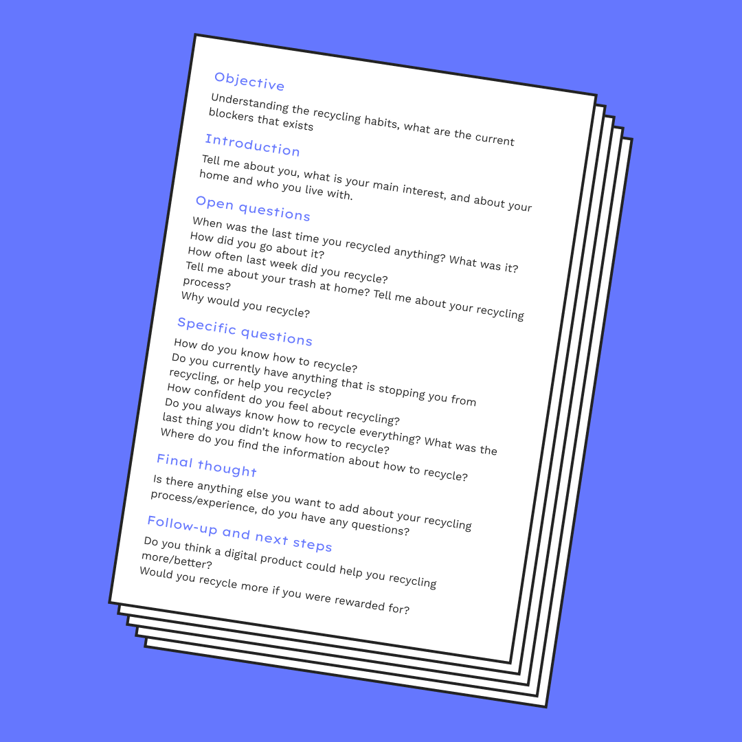
In my user interviews, I created a series of questions to understand the knowledge they have about recycling and the method they use, what they like, what they don’t, where is the problem.
I interviewed 7 users, that all have experience with recycling from 28 to 67 years old, living alone, in a couple, with family, or with flatmates in capitals or smaller cities across the UK, France, and Spain.
Discover
Affinity mapping
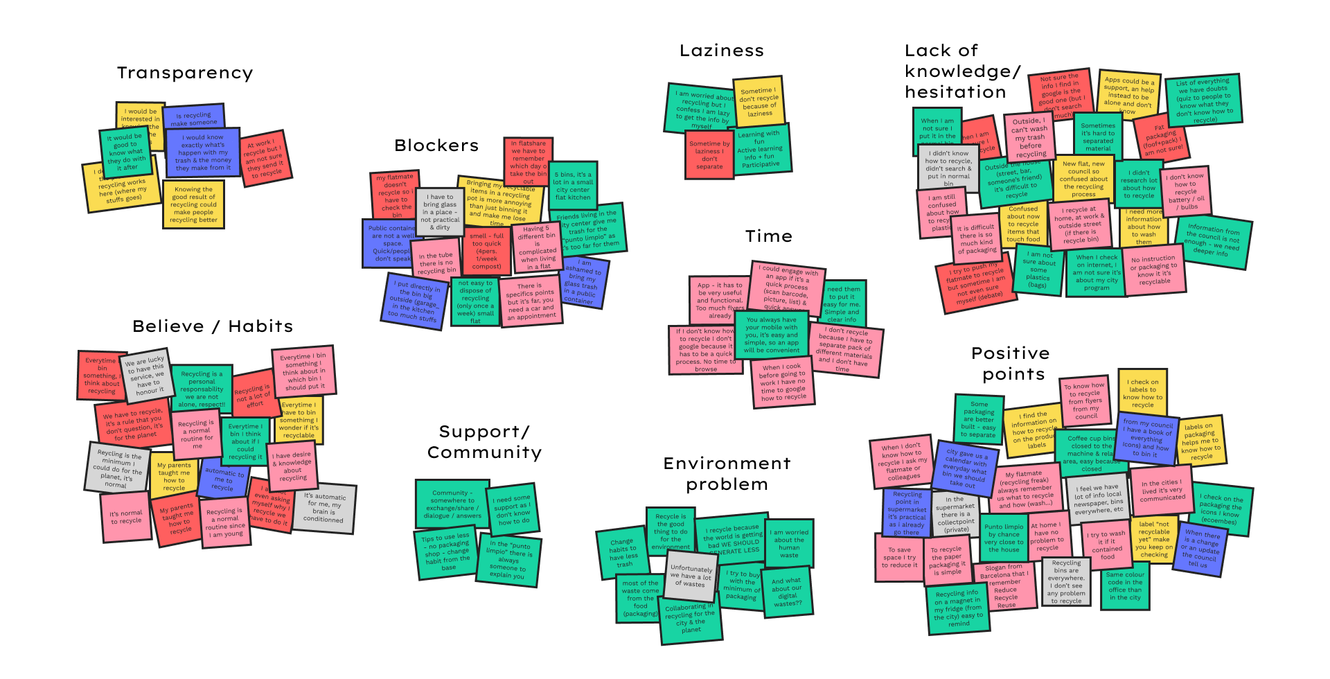
I collected all the insights coming from the interviews and group them by themes to start to create areas of thinking.
Discover
Findings
Goals and Motivations
- It’s normal for people to recycle.
- They do it for the planet.
- They are concerned about our waste.
- Cities and countries have a good recycling program available to everybody.
Pain points
- They have no time to search about recycling.
- There is a lack of information about some products (plastics, if touching food).
- They would like to know their impact, know what happen to their rubbish.
- It has to be easy, quick and functional.
- I need some support from others to know how to recycle and to help me to consume differently.
- They sometimes don’t recycle for laziness, it has to be put easy for me.
User needs a way to find quickly the right information so that they recycle well a product
User needs to find some support so that they recycle better
Discover
Personas
The interviews helped me get to know the User personas better. I was able to create three persona profiles whose needs will drive the content of the app.
Define
Define
Sketching
Sketching ideas about searching for a product from a list, by categories or scanning the barcode, and the results.
Define
MVP
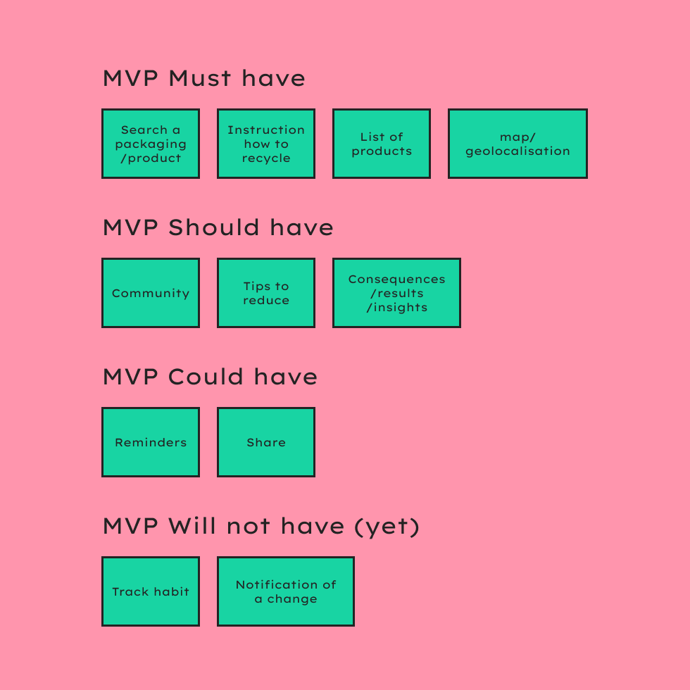
Using the Features Prioritisation 2×2 matrix I listed the features necessary by order of priority:
- Map/Geolocalisation
- Search a packaging to recycle
- Instruction on how to recycle
- List of products
- Community
- Tips to reduce
- Consequences / results / insights
- Share
- Reminders
- Notification of a change
- Track habits
Looking at other apps I could realise that the search should be quick (scan bar codes, search by category) and the learning not boring but more interactive, funny.
Define
Sketching
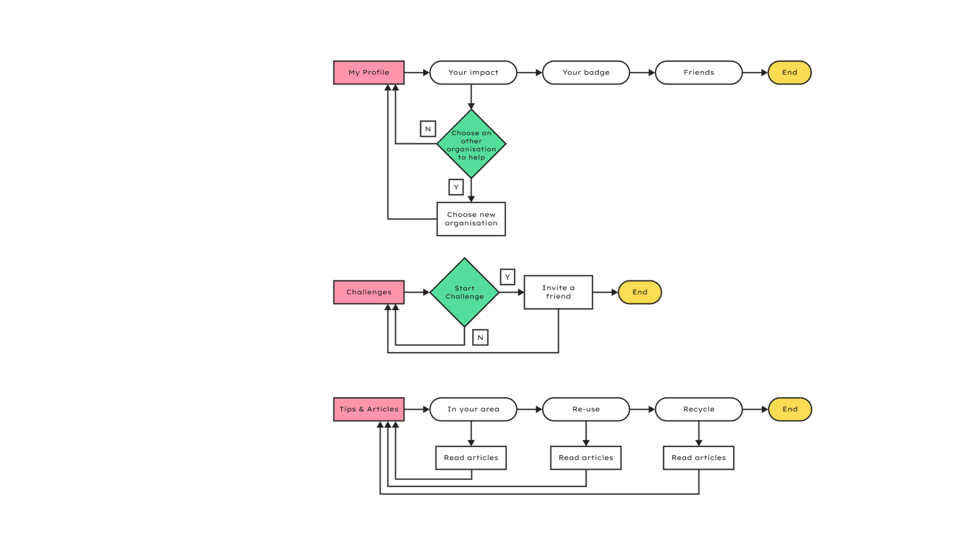
MVP Must have user flow

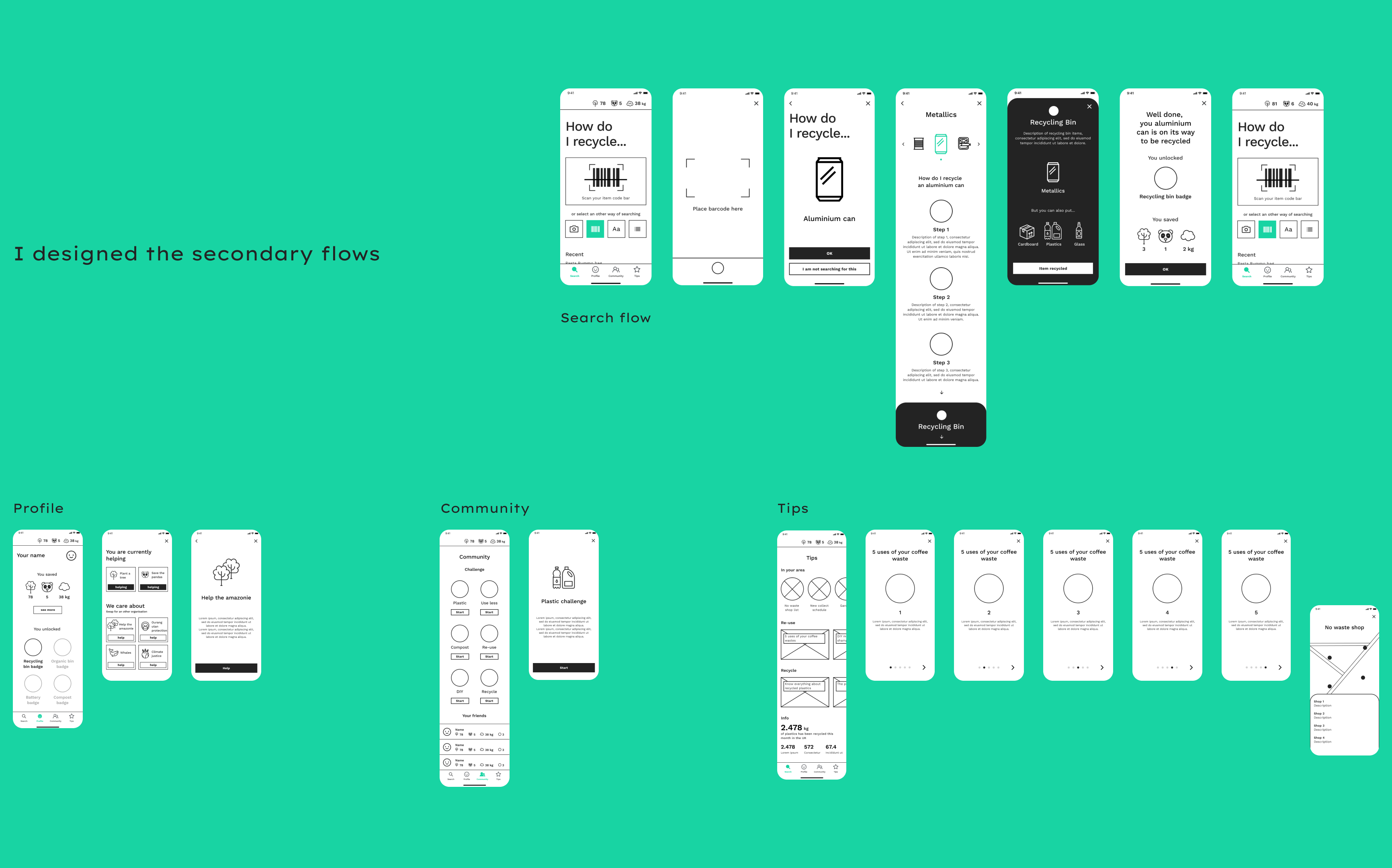
Secundary flows
Design
Design
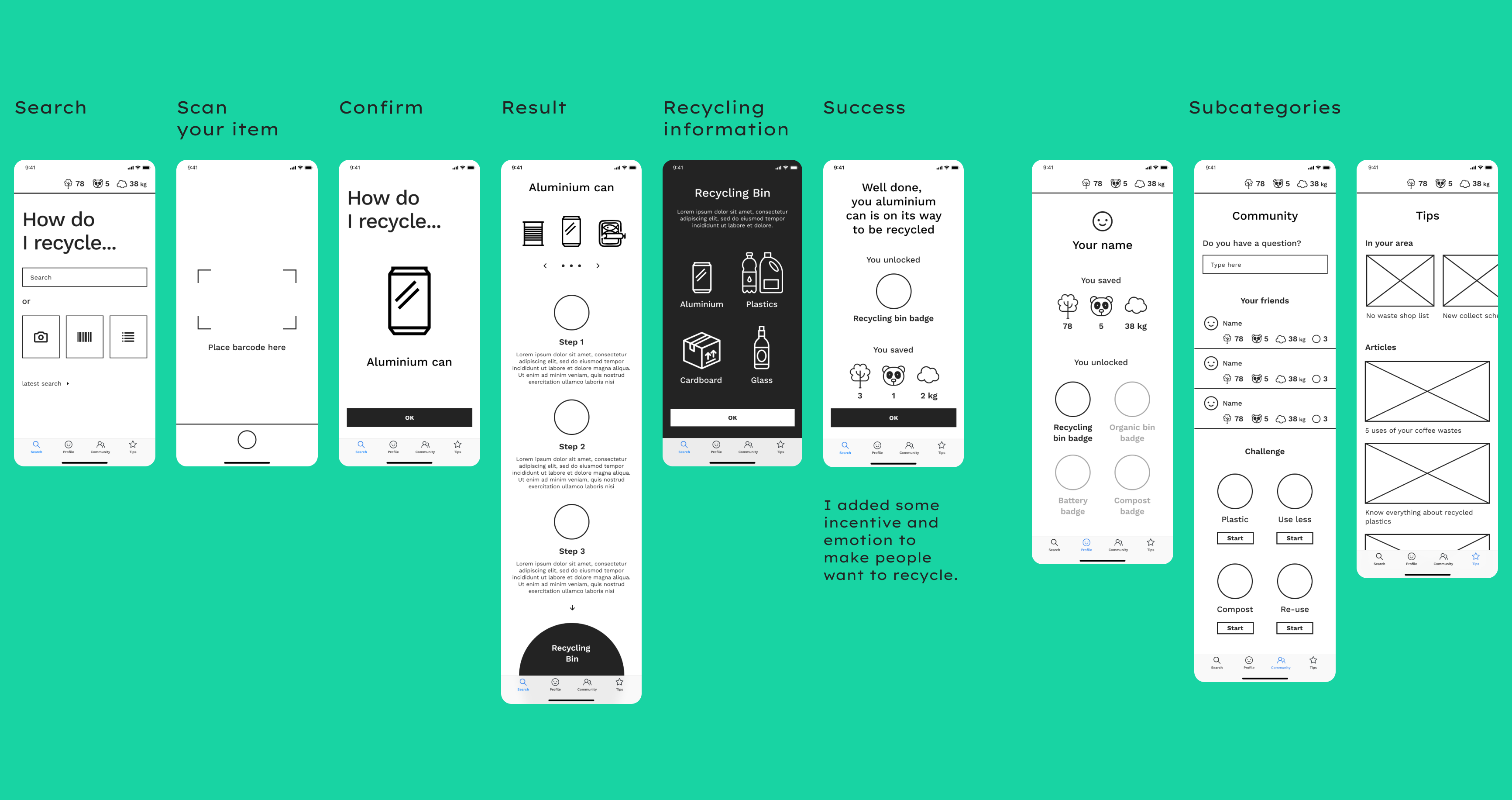
Wireframes & 1st prototype
Design
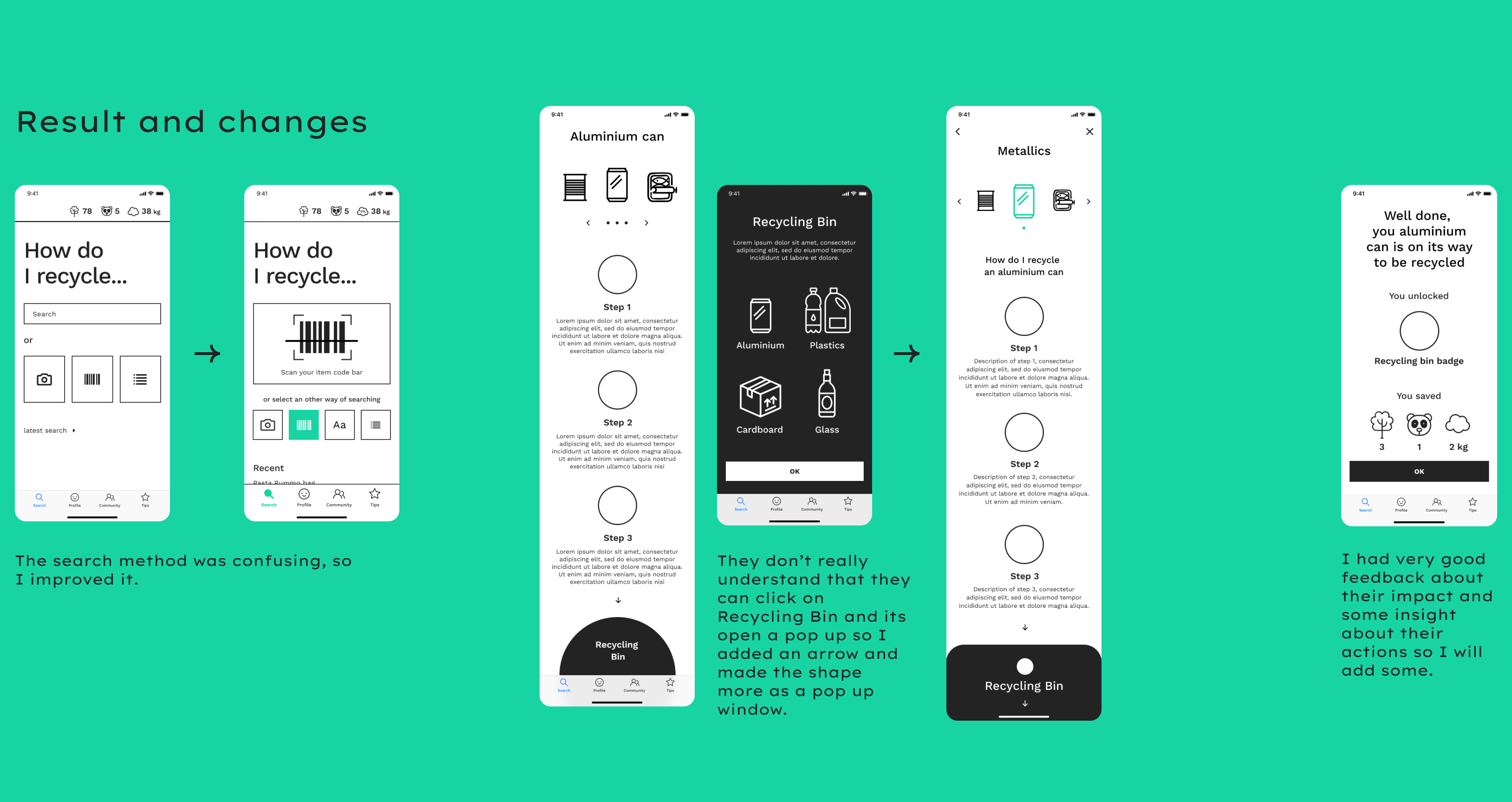
Usability testing
Design
2nd prototype
Design
Usability testing 2
Design
High fidelity flows
Design
Usability testing 3
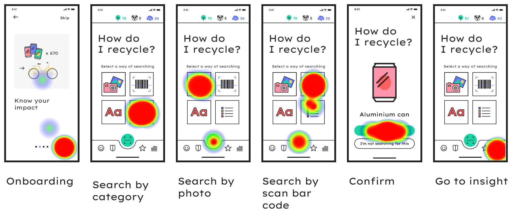
I used the Maze tool to realise unmoderated testing.
56 users tested the website. Overall the feedback was nice, all was well understood as we can see on the heat map below.
“Nice to have the info on how I recycle!”
“It is very simple and understandable.”
“C’était bien j’ai eu mon premier panda”
“It was nice, I had my first panda”
“Easy and intuitive”
Design
Last changes
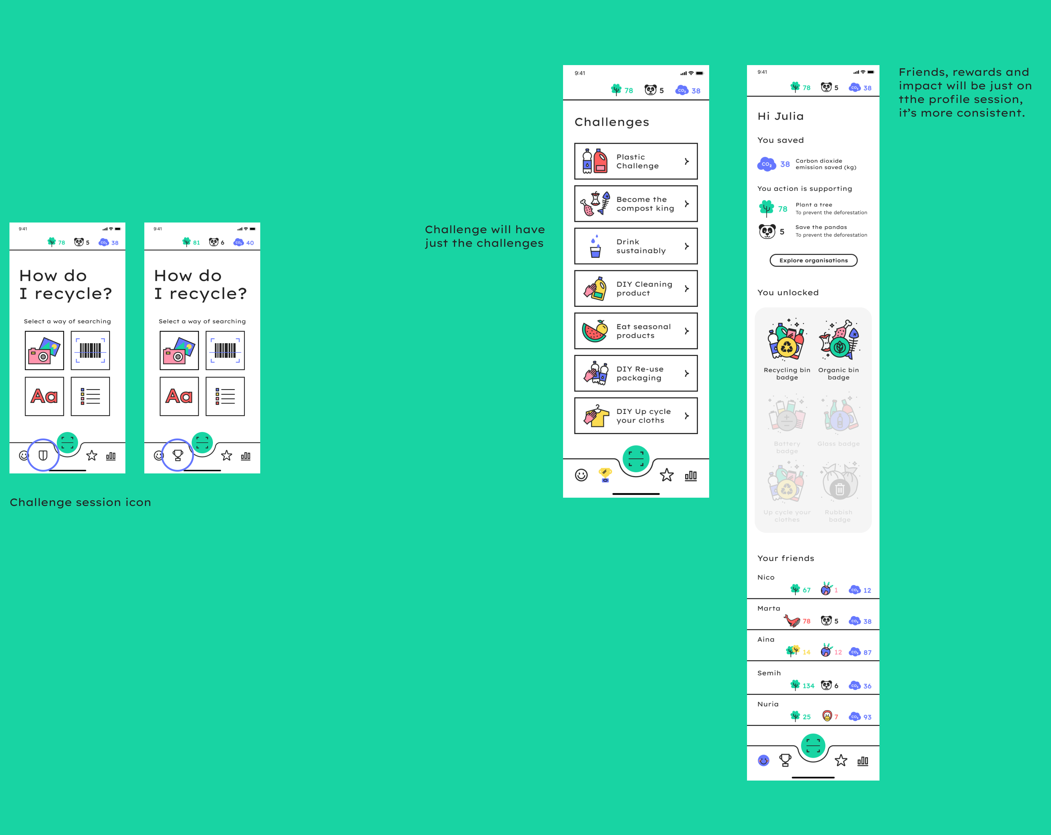
Design
UI Design Library
After setting all the content of the app, I defined the design. Colorful, simple and easy, this UI Design Library is perfect for the recycling app. I defined the colour palette, the fonts and the illustration style.
Design
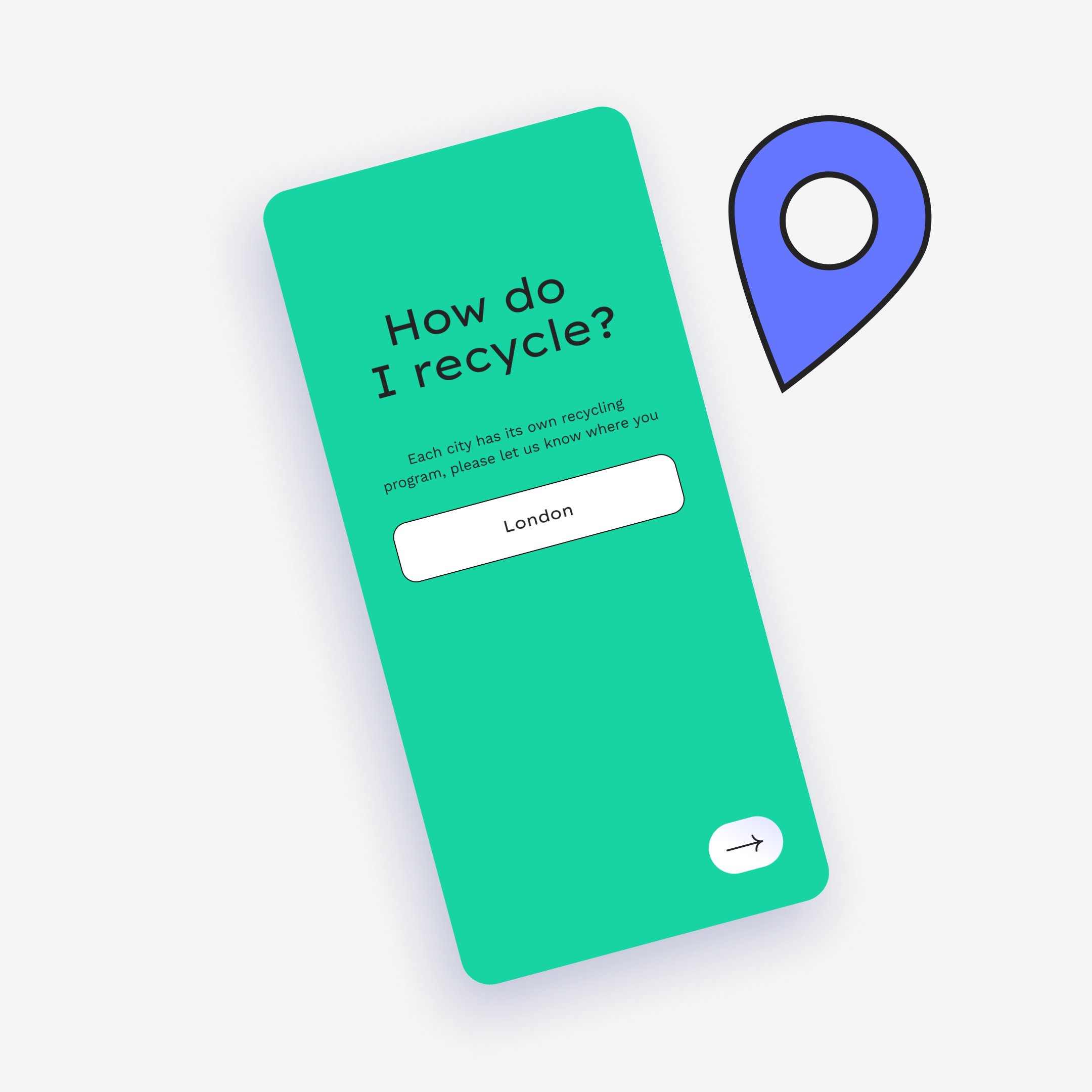
Set up your location
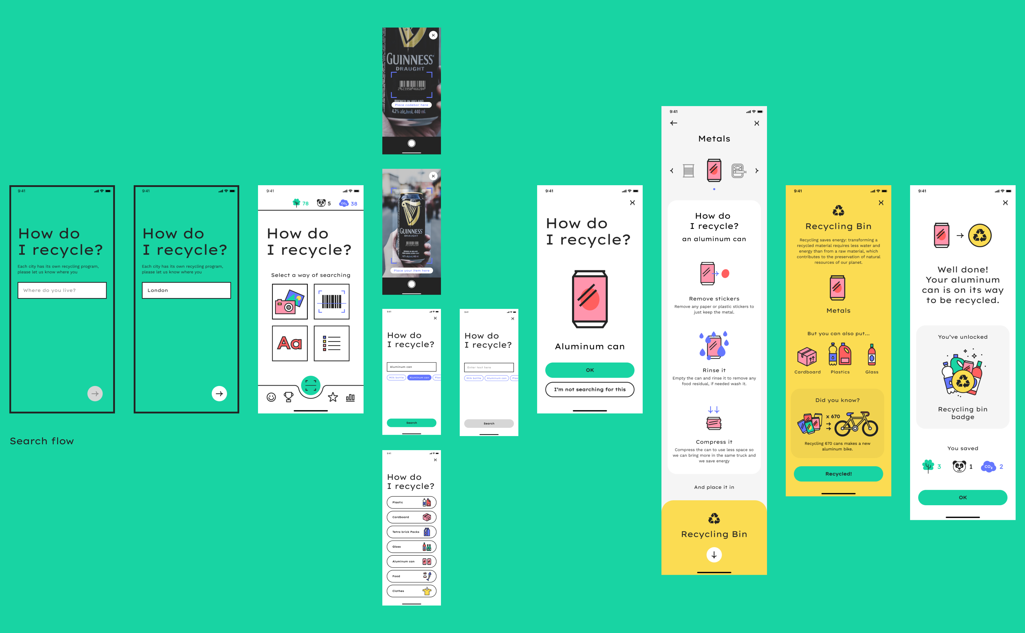
Recycling schemes are different depending on the country, city, or neighborhood you are living in. It was so important that when you enter the app you first set up your location.
Design
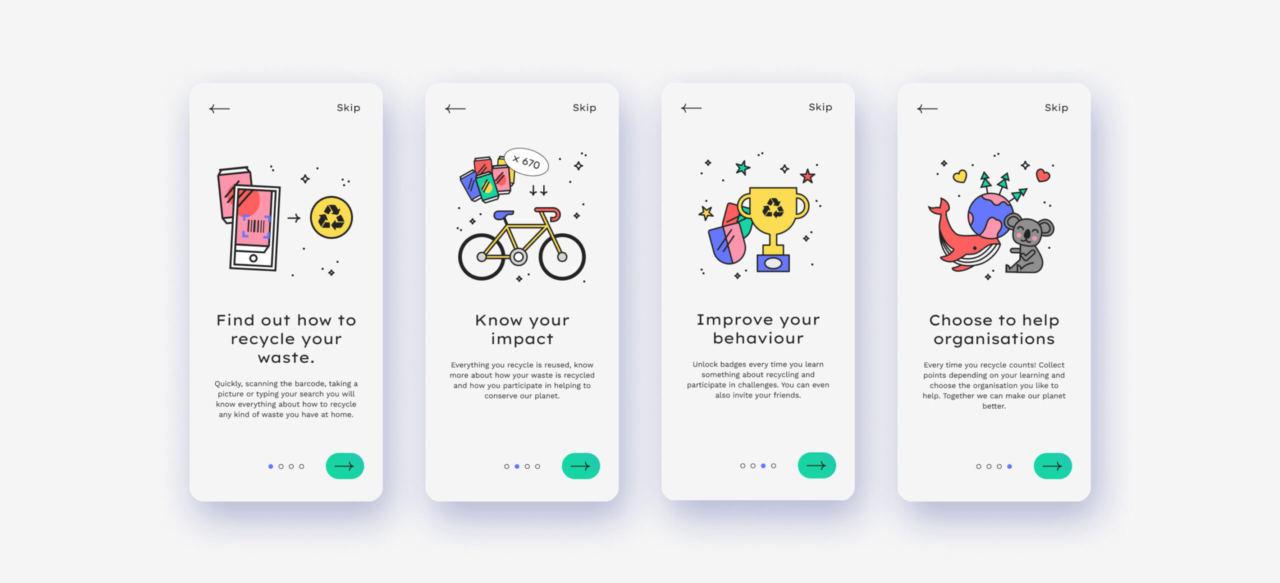
Onboarding and emotions
The tone of voice is kind and friendly, instead of alarmist and directive. The illustrations of the app follow this principle, create emotion and make the recycling something nice and participative.
Design
How do I recycle?
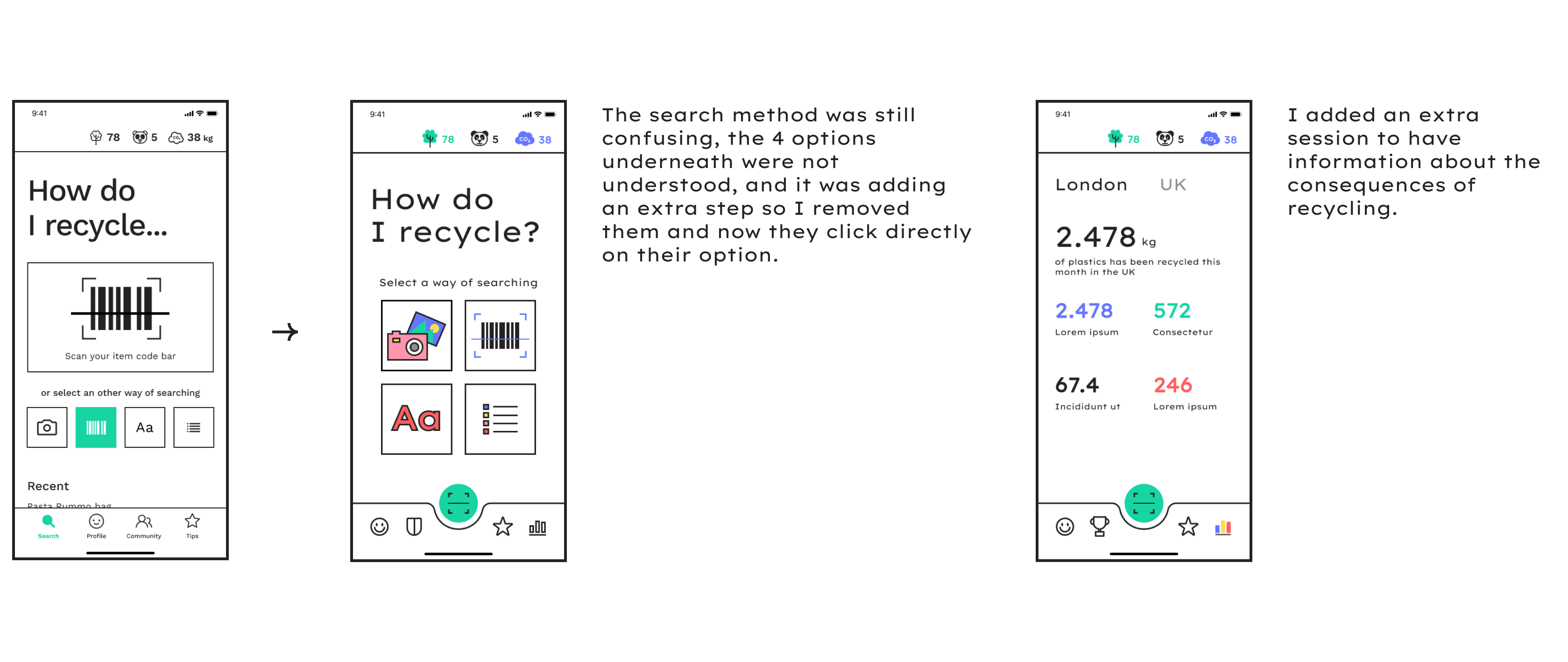
After testing I found that different ways of searching would be useful for the users. I created this landing screen that gives the four options to the user: Search by taking a picture, scanning the codebar, typing the product name, or by category.
Design
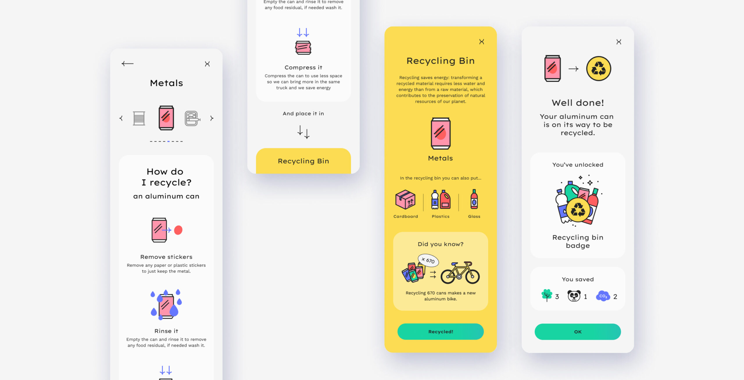
The recycling process
Once you have selected your item, you will receive all the instructions on how to process to recycle it. Do you have to wash it, compress it, which bin do you have to use?
Recycling items make you earn points for the associations you are following. You will also learn what is the impact of your recycling.
Design
Profile screen
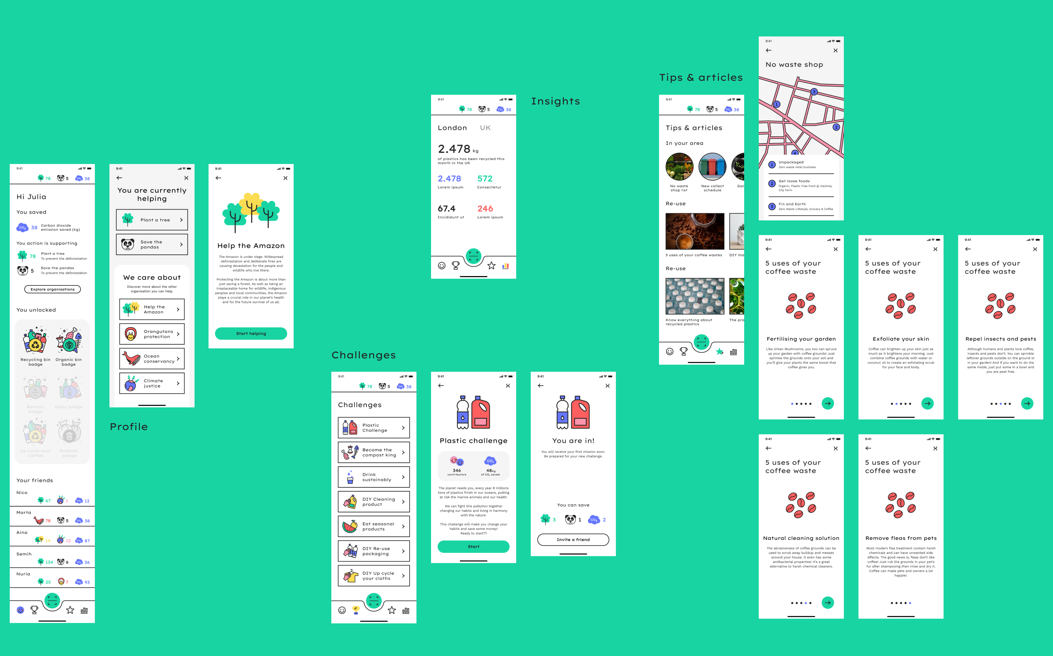
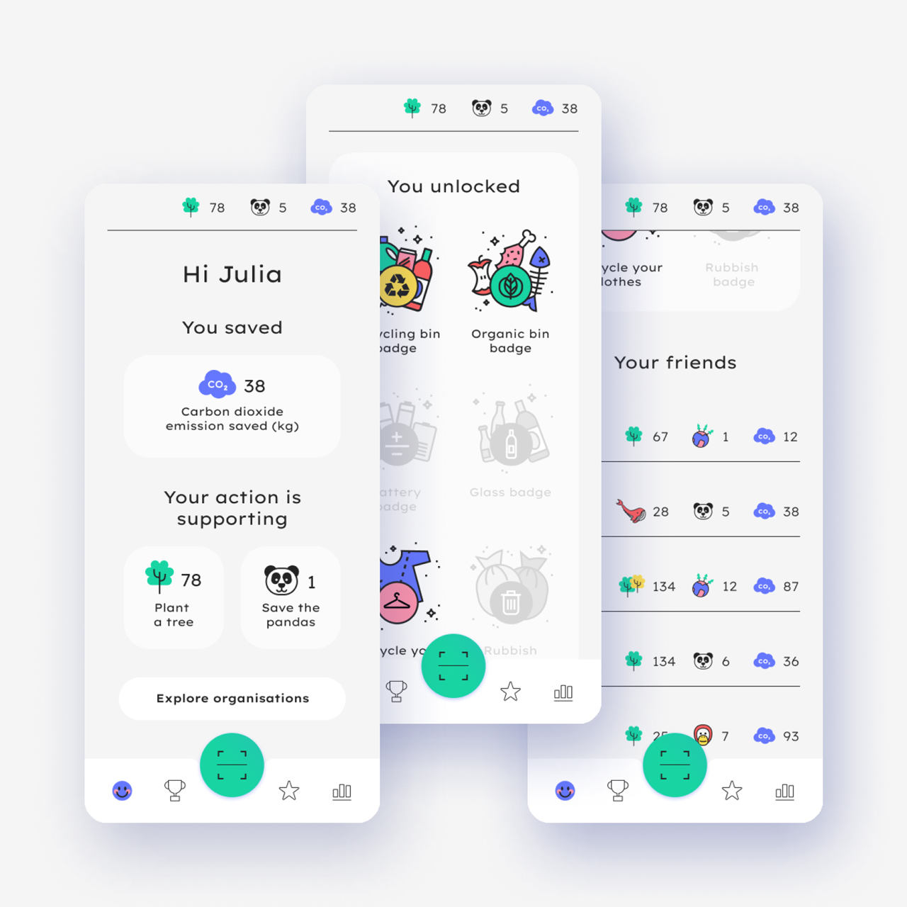
The profile section allows the user to know their impact seeing how much emission they have saved, how many trees they have planted as an example. They can follow the badges they have unlocked and the progression of their friends.
Design
Helping organisations
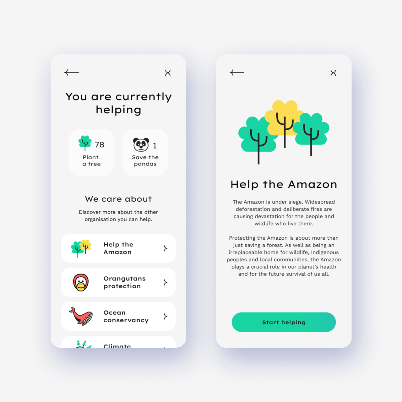
The user chooses the organisations they want to help, can add one, or change at any time.
Design
Challenges
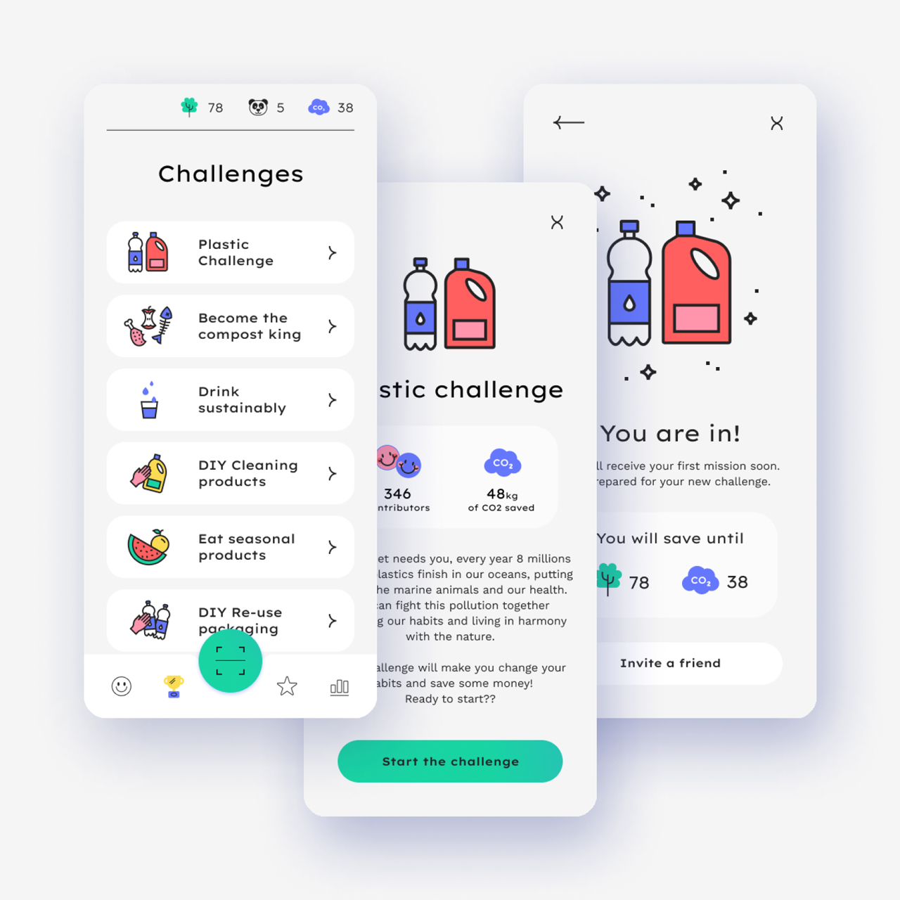
The user can participate in challenges, that will make them learn how to change their recycling and consuming habits.
Design
Tips and articles
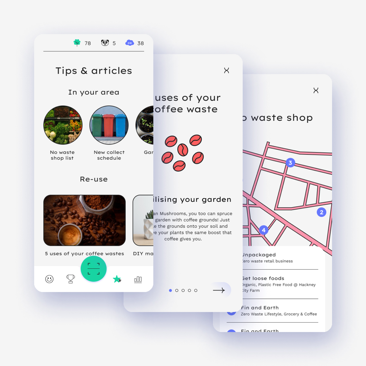
This article section is helping you to learn new habits, know better your area and the clean shop.
Design
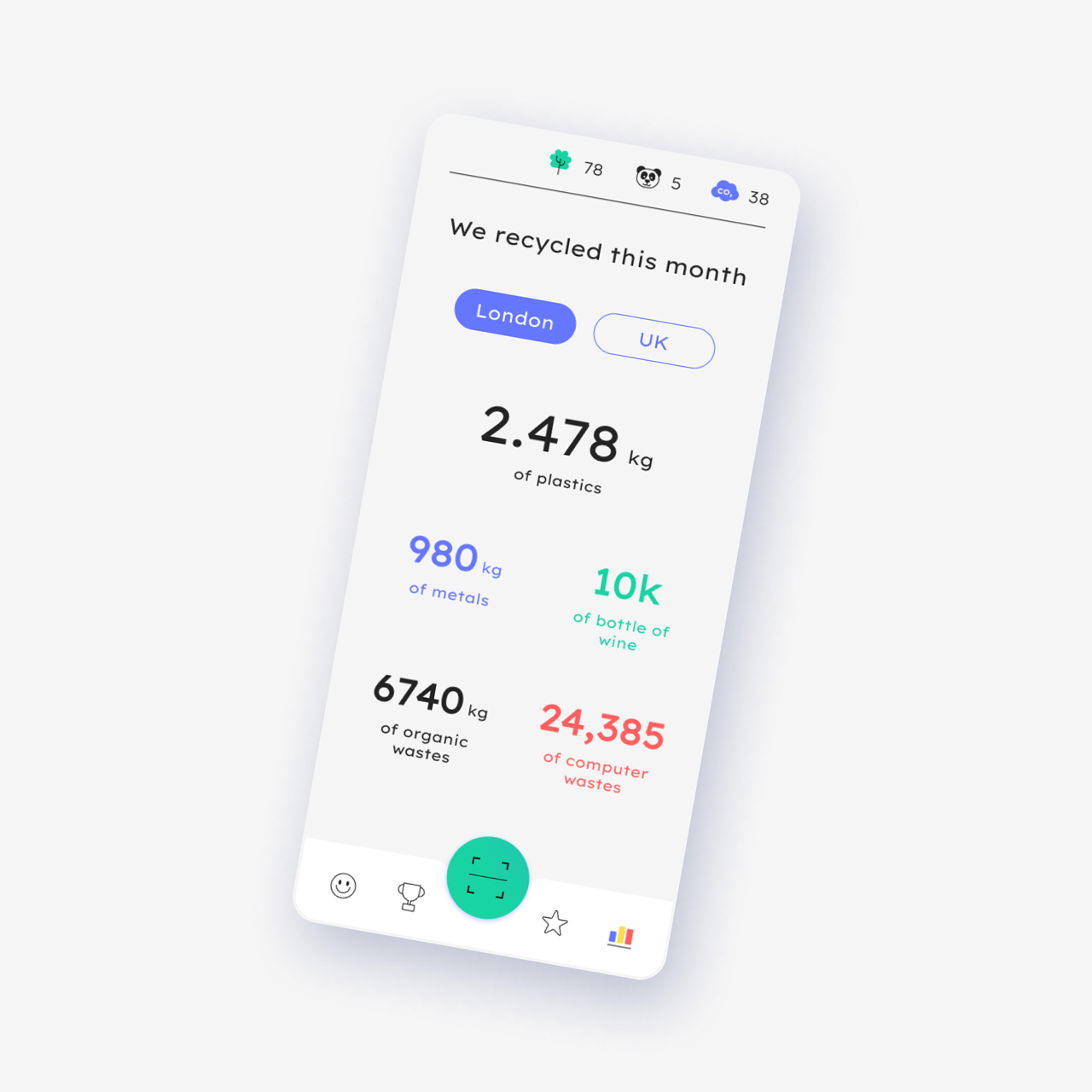
Insights
This last section is to show bigger data about recycling on the scale of the user city, country to them to understand the amount of waste recycled and knowing their help.
Design
Easy navigation
From the tab nav always displayed at the bottom of the screen, the user can easily navigate between the four main sections of the app: My profile – Challenges – Tips and articles – Insights. The big green button is to, at any moment, come back on the How do I recycle? search screen.
Back to home
