Cycle pharma
Branding, Web design, UXCycle pharma
New Branding & Web Design for Cycle Pharma, an existing British pharmaceutical group. Socially conscientious, they innovate and optimize pharmaceutical drugs across orphan, generic, repurposing and formulation technology, endeavoring to enhance the lives of those they serve. They needed new branding to reflect their goals.
Info
Photoshop
Illustrator
WordPress – Avada theme


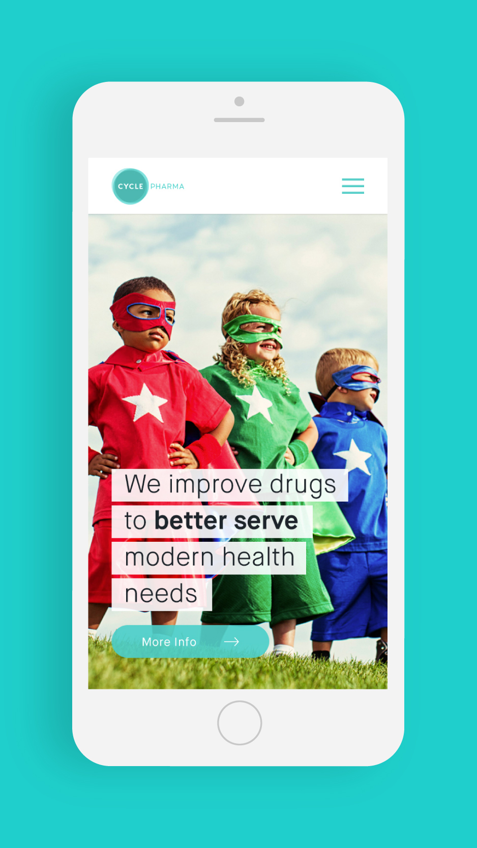
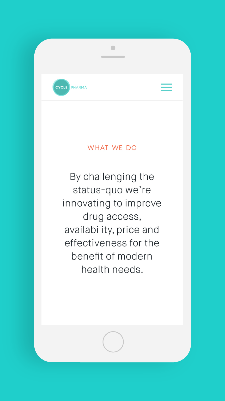
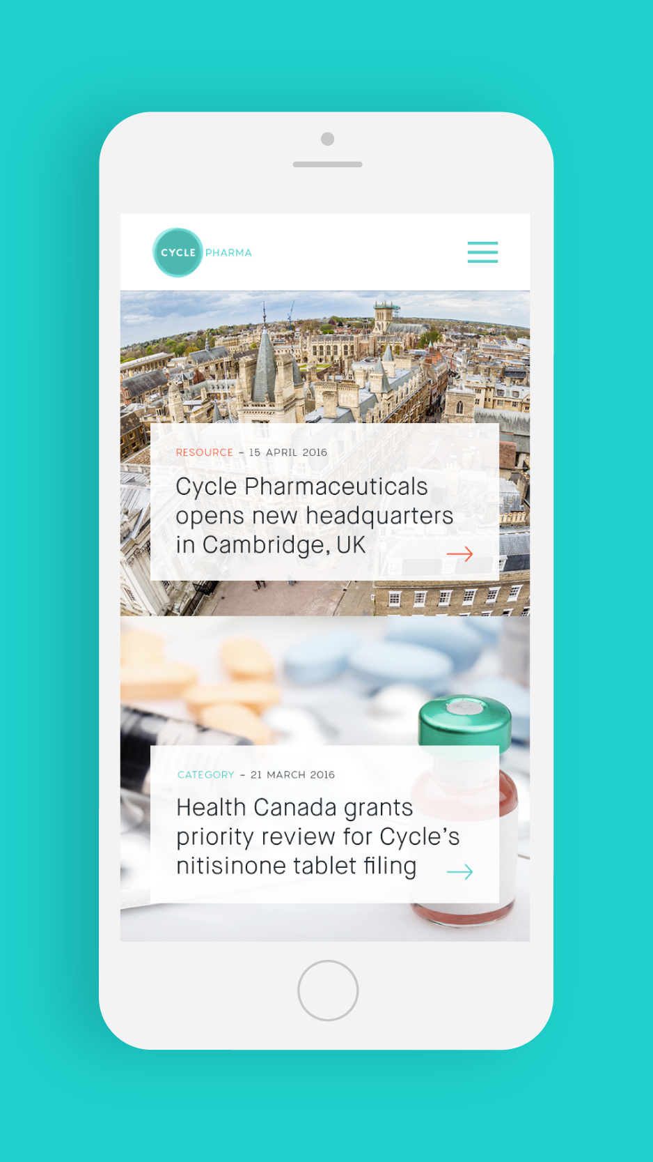
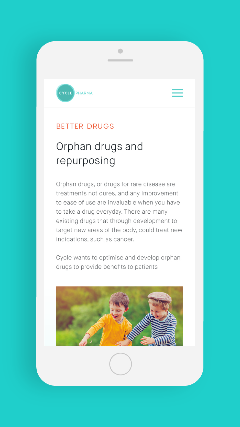
New branding
Conscientious and innovator
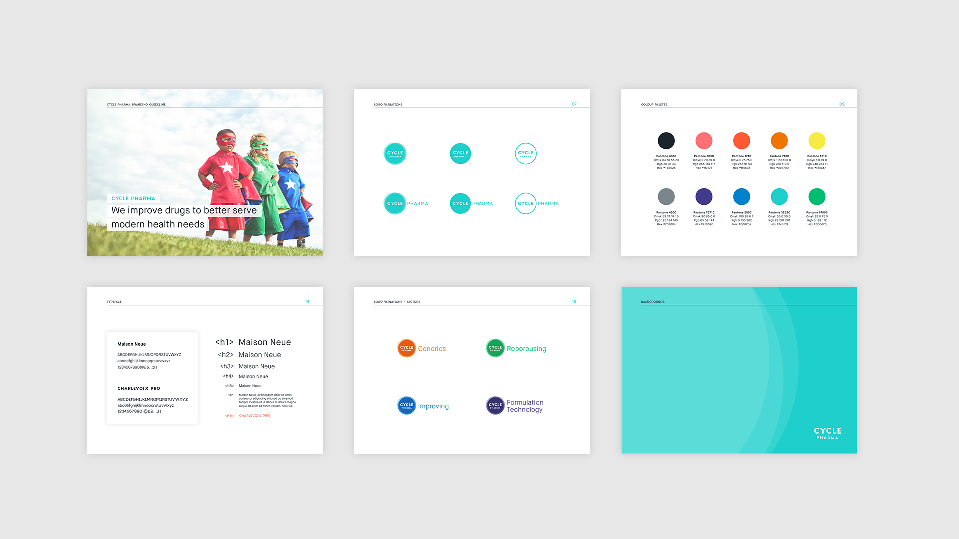
The new logo intermixes different circles that represent the different sectors of activities of Cycle Pharma. Mixing them reinforces the character of the brand.
Adjustable
The logo
Cycle Pharma logo needs to be adjustable to the different support the pharmaceutical use: from digital to print and packaging.
For this, I created variations of the logo using the different transparencies of the circle, just one circle, the circle outline or no circle to increase the readability anywhere or any size it’s printed. With the text, in the very small formats I remove the word Pharma, not readable to just keep Cycle.
Variations
4 sectors
Logo variations for each activity sector, declination of the colour palette and application of one colour for each sector that we will find in the sector page in the website design.
The website
Light, clear & modular
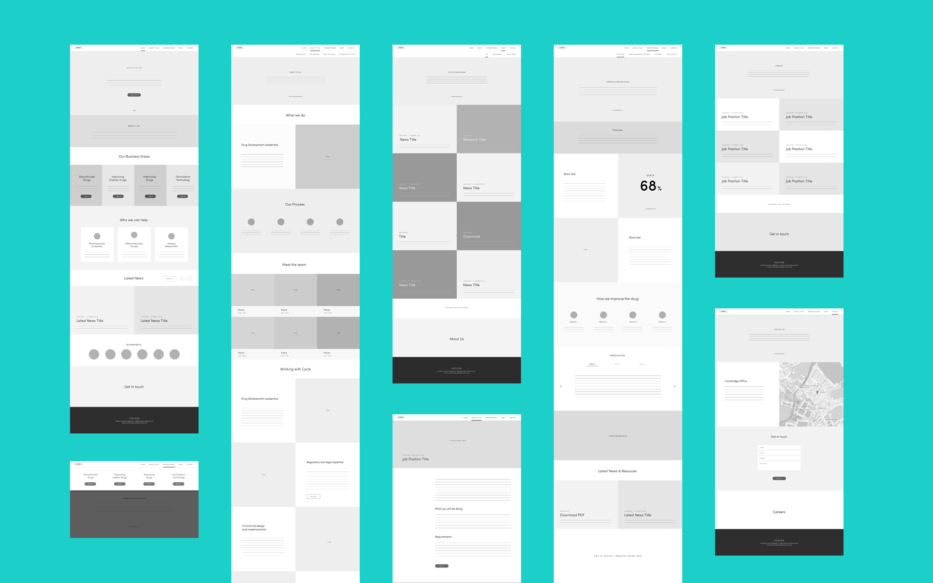
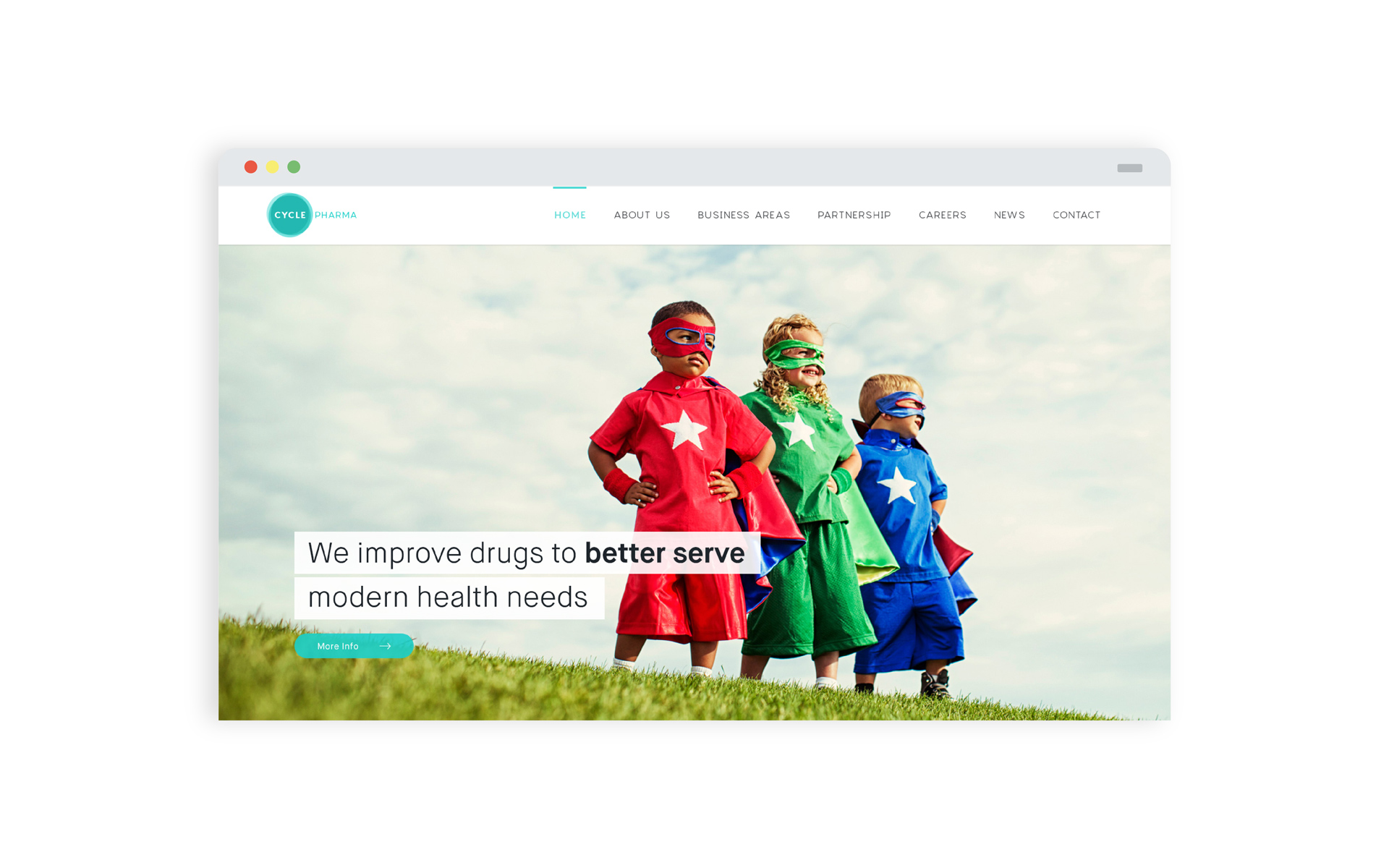
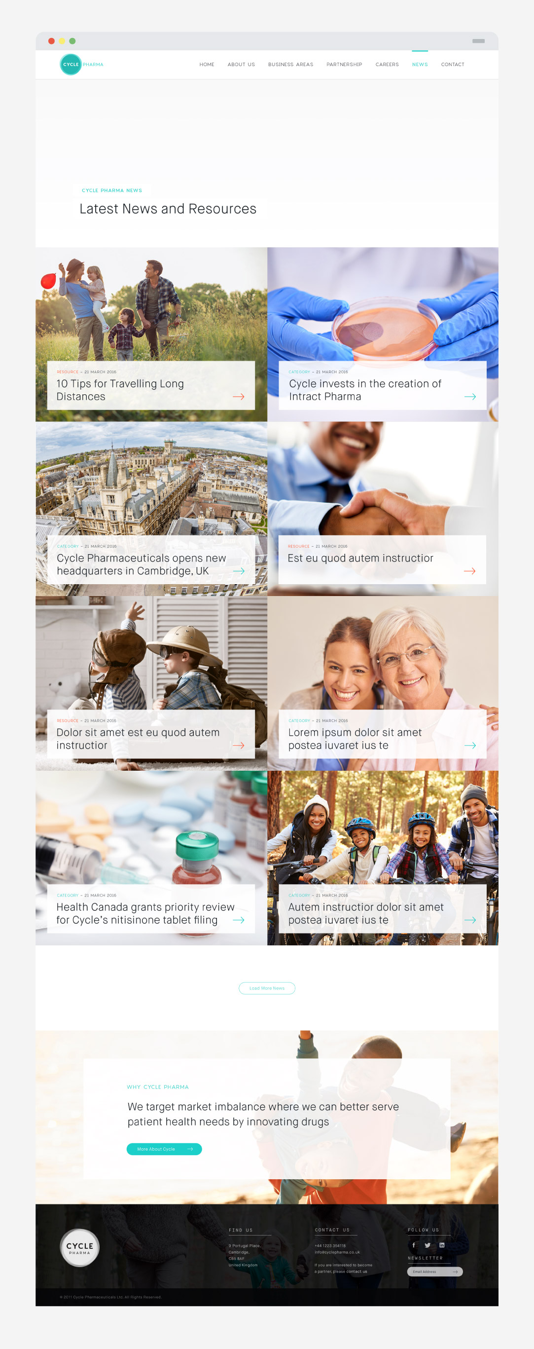
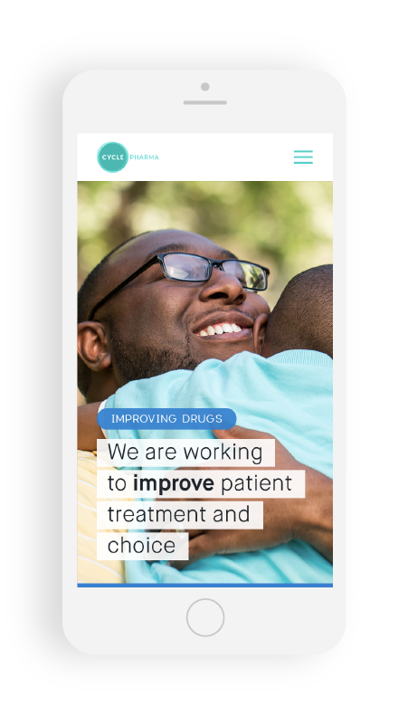
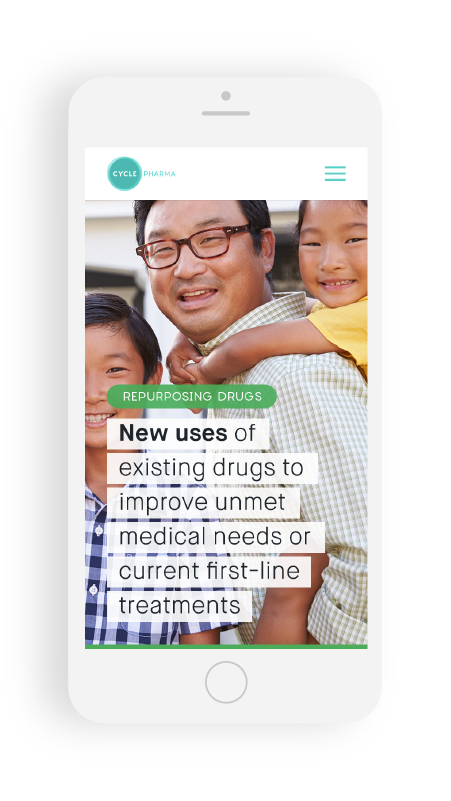
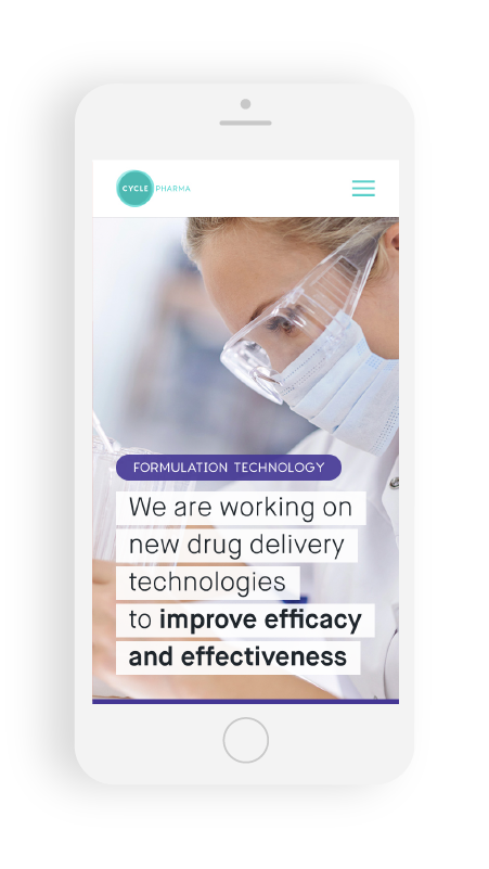
I arranged their content in very organised wireframes and designed the website in a clear and modular website reusing components as we built it on Avada WordPress.




Next project
Summer icons
Icon design
