Affiche Composée
Poster designCommuniquer avec peu
Affiche Composée
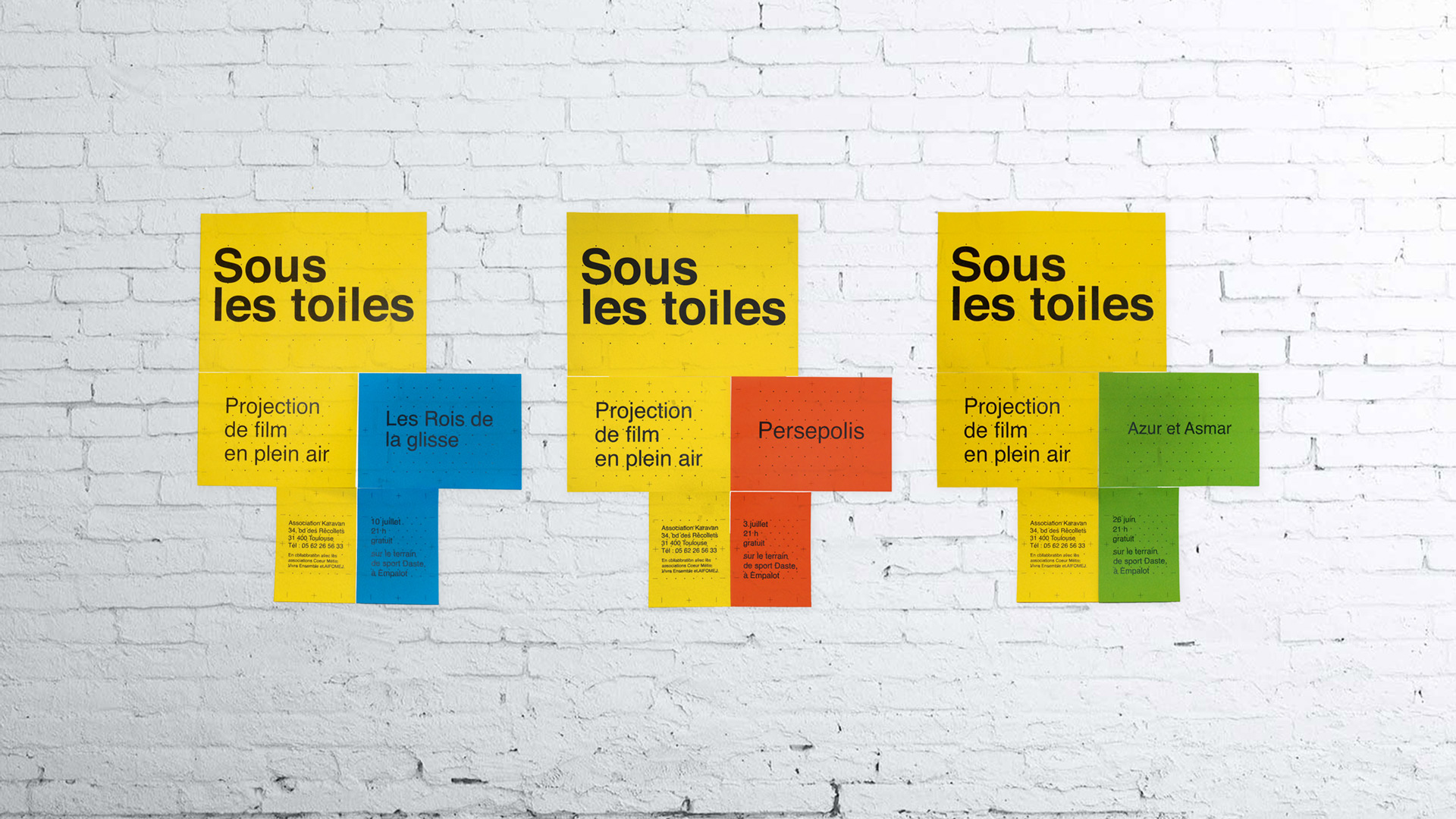
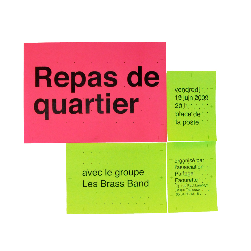
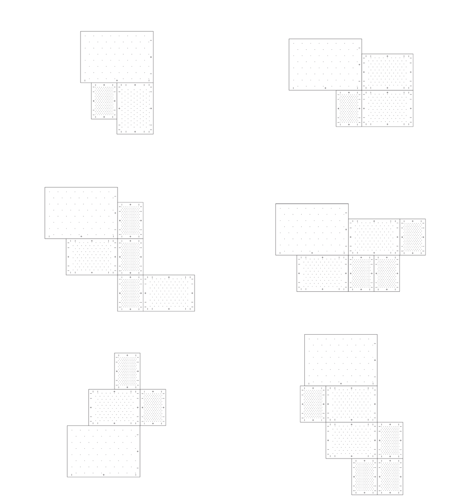
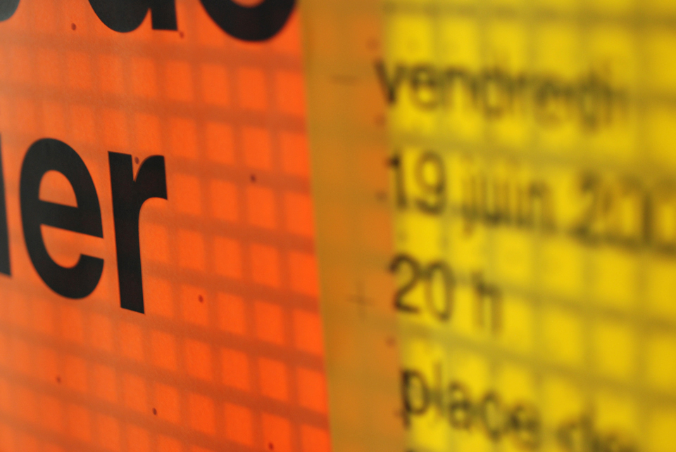
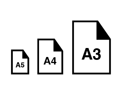
Affiche composée is a banner system based on the combination of three standard formats: A3, A4 and A5.
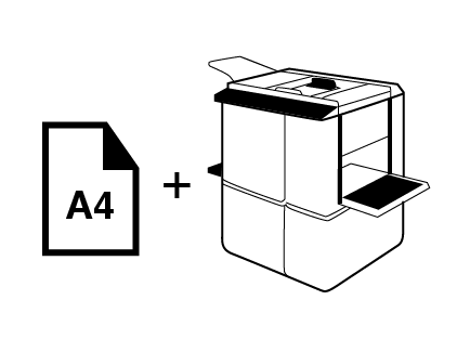
The associations cannot print larger than A3 format because of its cost, so they usually use standard office printers. For their posters to be visible in the urban environment, I created a system of signs through a combination of these formats different from rectangular ones.
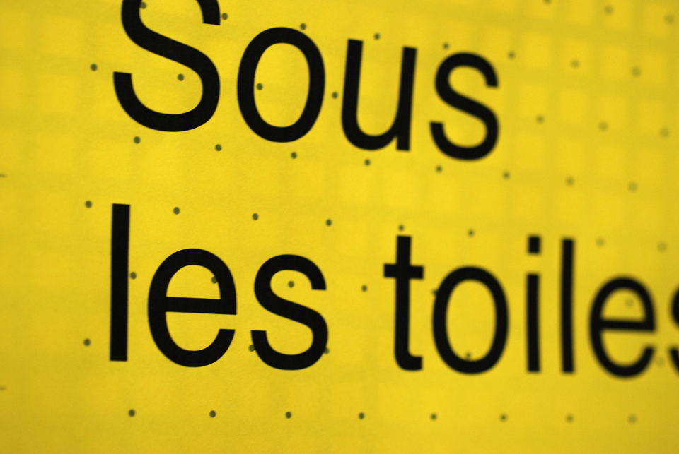
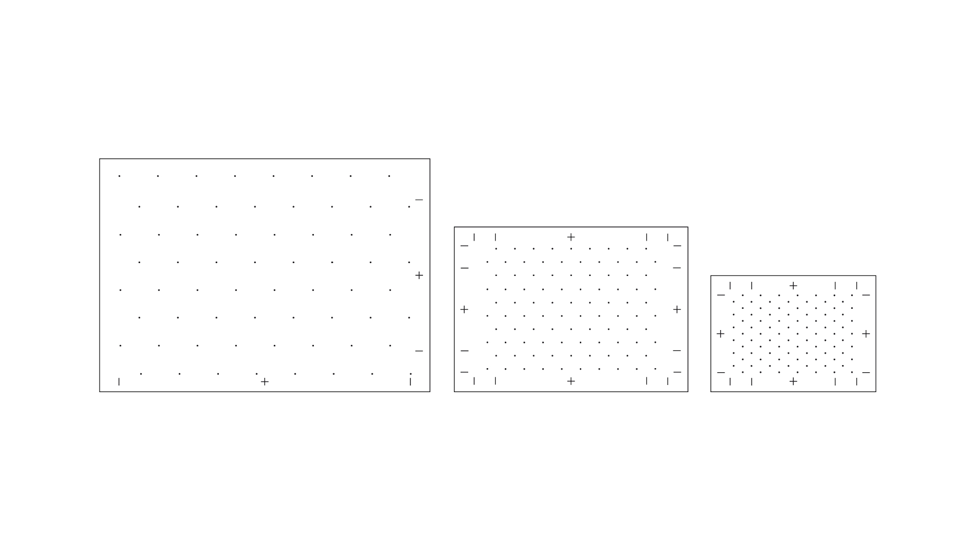
The information is classified according to its importance in different formats thanks according to a simple rule that indicates the size and thickness of the letter. This system allows to rank just the information and to create a large format poster. You can modify some of the information without changing everything and create your own poster format among several possibilities. The textual information and the different sheets composing the poster are easily accommodated by including graphical frames given by each format.
There is also an ecological and economic objective: To change information, it is enough simply to reprint only one format and not all.
Info
Sketch
Zeplin
Illustrator
iOS & Android app

Communiquer avec peu
Photocoplis
Affiche composée
Timic
Affiche gommette
Mini Post It
User manual
Next project
Mini Post It
Typography, Signage
